Tuesday, 20 September 2011

Inspiration [Music Videos]

For our video, we have taken inspiration from videos of the same genre which we feel will express the song well including colour, effects, shot-type and style.

Girls - Lust For Life
These shots from the Girls' video for 'Lust For Life' show a girl, silhouetted by the sunset. We feel that shits like this will give our videos a dreamy and summery feel, like the similar shots from the M83 video.
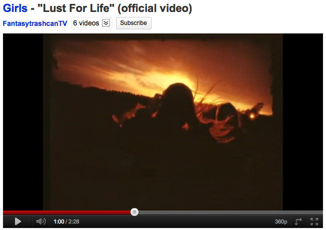
However, this split-screen effect is to hectic for our tastes, and if we were to use a split screen it would be limited to two shots, to show contrast and similarity between the two characters.

Black Lips - Drugs


This video for 'Drugs' by Black Lips uses vintage-looking footage to illustrate the hallucinogenic and mind-altering effects of drugs. We will try and replicate some of the shots, particularly the first one, but possibly with leaves or sand instead of pills.

Warpaint - Stars


This naturalistic video includes slow-motion shots, underwater shots, superimposition, surreal light effects and natural settings. We will try and emulate some of these properties in our video, as we feel they go well with the genre. The shots with a projector are also effective and we may use this technique.

Lana Del Rey - Video Games/Blue Jeans


These videos by Lana Del Rey are almost like a compilation of vintage Super8 footage, clips of popular influences like Snoop Dogg and Paz de la Huerta, skateboarding videos, home movies, neon lights, panoramas and finished off with shitty clips of her singing into a webcam. We like the overall effect that the videos create, but the cheesy and unprofessional performance combined with inconsistant editing gets a big thumbs down from us.

M83 - We own the Sky

This use of light and focus in this video give it a dreamy summer feel which we think will work well in our video. A shot similar to the one of the corn field above will link in well with our theme, as will the running through the field shot, however we will be filming bare feet running through a field and additionally through the surf on a beach.

Inspiration [Art]

Pakayla Biehn


These paintings by Pakayla Biehn take advantage of the 'double exposure' effect. In film and photography, double exposure is a technique in which a piece of film is exposed twice, to two different images, giving a dream-like, surreal outcome. We can edit our recorded footage to give this effect, and we think it will express the themes and psychedelic nature of the song.

Saturday, 17 September 2011

WU LYF - Go Tell Fire To The Mountain [Digipak Analysis]


The digipak for WU LYF's "Go Tell Fire to the Mountain" album is very typical of alternative/dream pop, by being very non typical compared to other styles of music. The front cover is a reference to the title of the album, a picture of a mountain with the bottom ripped to expose a fire. The album is also not presented in a typical CD jewel case, but rather a cardboard digipak, usually reserved for special editions of albums, eco-friendly editions, and sometimes, as in this case, self-released material.

The album uses a very simplistic but still artistic and meaningful design with its artwork, the front cover consists of one photo, which I have previously mentioned. The back cover is the same photo, with the band's name, the name of the album and what seems to be some sleeve notes; all in the same simple font. The disc design is a painting, it is unclear of the situation depicted but it seems to reference slightly their video for "Spitting Blood", again, an obscurity, the usual for the genre.

Dum Dum Girls - He Gets Me High [Digipak Analysis]


This is the Digipak for another Dum Dum Girls album 'He Gets Me High'. The actual album cover looks quite intricate but is actually quite simple. The effective technique of placing a photo of Dee Dee holding her guitar underneath the text gives the effect of looking through a type of window into her life, allowing the audience to both relate to and idolise her. She shows her tattoos, wears red lipstick and all black clothes, symbolising the band's individual style, which is common in indie and lo-fi bands. Similar to the Digipak for 'I Will Be', this combination of subtle tones and contrasting white creates a bold statement by the band. The back of the pack is also similar to that of 'I Will Be', using a simple graph-like layout which does not detract from the content. This clearly illustrates the power of substance over style, and gives all of the Dum Dum Girls' Digipaks consistency. The designs of the vinyl and CD are also similar. The vinyl is plain black with an almost kaleidoscopic center. This design is reflected on the actual CD, and also on the inside of the CD case, also creating consistency. The poster is the same image on the front of the album, but blown up with a smaller subtitle of the band name, title and record label underneath the main image.

Dum Dum Girls - I Will Be [Digipak Analysis]


This is the Digipak and poster for Dum Dum Girl's album 'I Will Be' on Sub Pop. The poster is from a gig in Glasgow in 2010, and uses the same picture as the album, which allows the audience to relate that image to the band. As the foreword on the back of the pack states 'This is lovingly dedicated to my mother'. This means Dee Dee's (the main singer) mother, who died from a terminal illness while the album was in production. This shows Dee Dee's affection towards her mother, along with the Polaroid of her when she was young on the album cover. This gives a solemn but uplifting feel to the album, and helps the audience relate to the band. It also gives the album a vintage feel, which is also exaggerates their genre of music. The red colour of her shirt on the album cover is emulated on the vinyl, giving the Digipak consistency. The white bubble-type font contrasts with the soft tones of the photo, drawing the audience's eyes straight to the band's name and album title, making the album easily recognisable. This font is also used on the poster, but in black, to a lesser effect. The back of the album has a simple black and white track list, along with thanks to producers and additional musicians. This is effective because it allows the audience to concentrate on the actual content of the album rather than just graphics which distract the eye. The white background is contrasted with black font, using the same typeface as the front cover, also giving the album consistency. The tracks on Side A and B are listed in chronological order along with their running times; '1. It Only Takes One Night..........2:02'. The logo of the record label, S.U.B P.O.P, is small in the top right hand corner. The actual design of the CD is using the consistent font with a 3D effect; blue over red. This simple and effective technique using overlaying colours give the design depth, and is more interesting than a conventional reflective CD

Bigmouth Strikes Again - The Smiths [Advert Analysis]


The above is a poster for The Smiths' single "Bigmouth Strikes Again". It advertises the single very well and although simple in design, tells the audience all they need to know to buy it. The image is very in-keeping with the rest of The Smiths album covers, posters etc., an old, what looks like, a stock image with a coloured tint over the whole image, and it is the same image as the single cover, this shows consistancy. The title of the track and the name of the artist are the focal points in terms of text. The release date is also shown, as is the formats the single is available on, 7" and 12" with bonus tracks on either, possibly encouraging people to buy both and hear the exclusive bonus tracks.